I like redesigning this site. I've done it many times over the years, and it keeps getting simpler. Here's where it's at now:
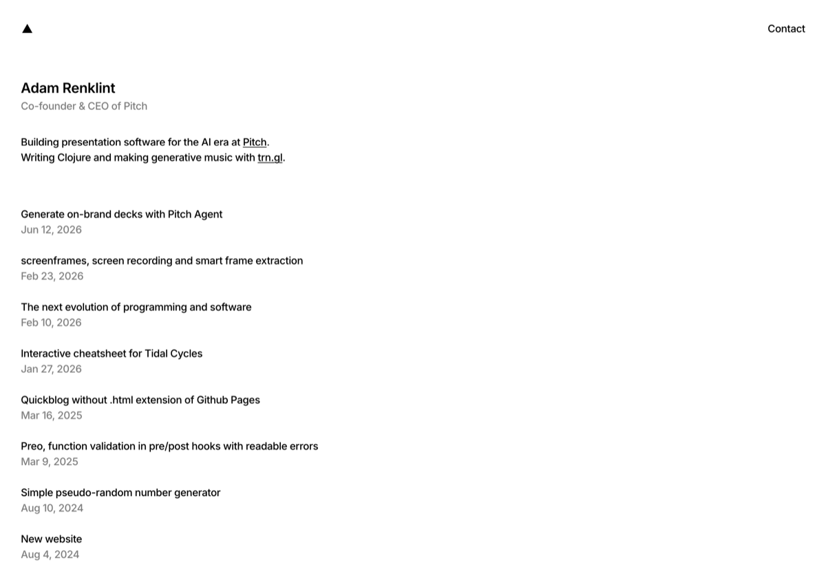
The look is modeled closely on shapedbyrobin.com, the personal site of designer Robin Granqvist (based on his "Mono" template). I'd been circling something Swiss and typographic for a while without quite landing it, and his site was exactly the thing. Full credit to Robin for the design language — I just rebuilt it in my own stack.
What I was after was restraint:
- One typeface, one weight, one size. It's all Inter medium, 16px, everywhere — the name, the body, the dates, the links. Bold shows up only for the rare bit of emphasis.
- Hierarchy from colour, not size. Black for what matters, grey for everything supporting it — my role, the dates. That's the whole system.
- Nothing decorative. No rules, no boxes, no gradients. Early drafts kept sneaking in dividing lines and I kept tearing them out. A strong typeface and simple colours carry it.
- Instead of a menu, a single black triangle that links home, and a Contact link in the top right. No footer.
The thing that makes it feel balanced is the uniform weight. Once everything is the same size and weight, the only way to signal importance is colour — and that constraint is what makes it calm.
Every design before it
Half the fun of redesigning is that the old versions don't really disappear. The Wayback Machine has been quietly snapshotting this domain since 2010, so I can travel back and watch myself change my mind. A tour:

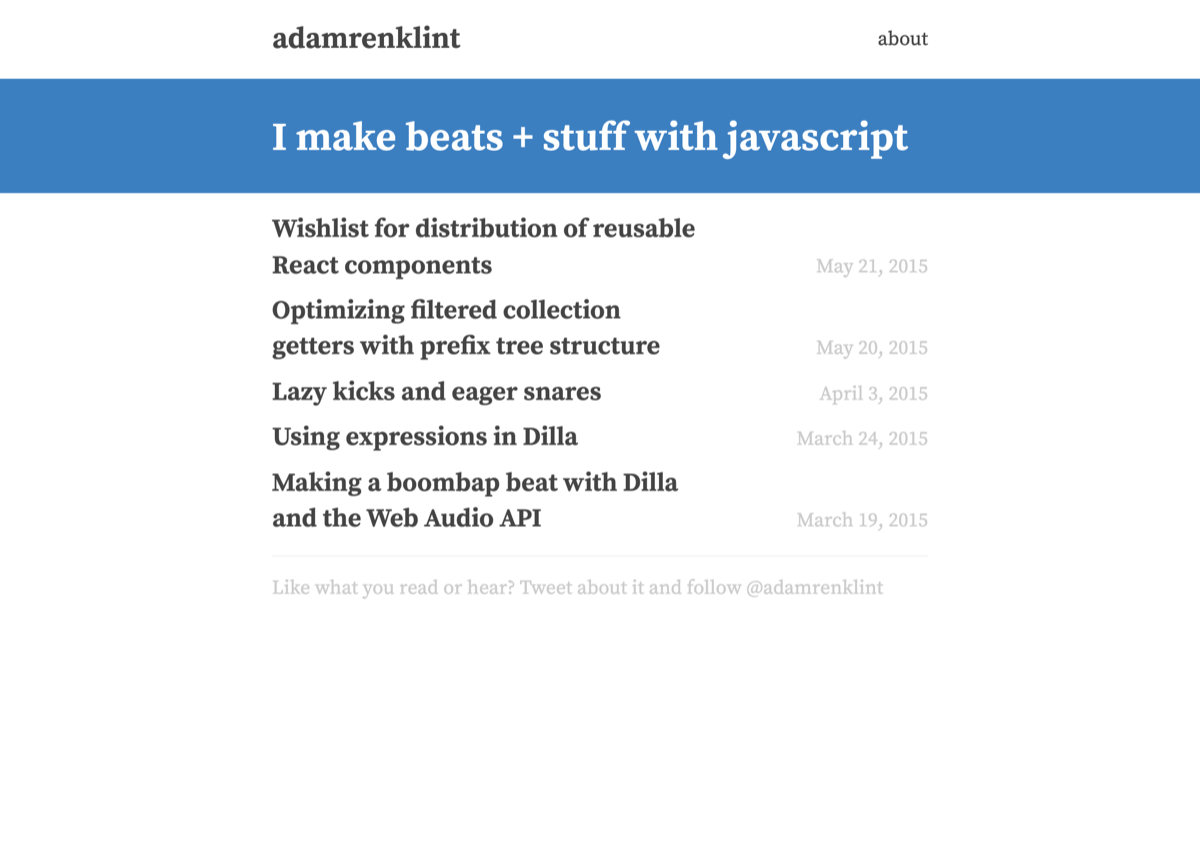
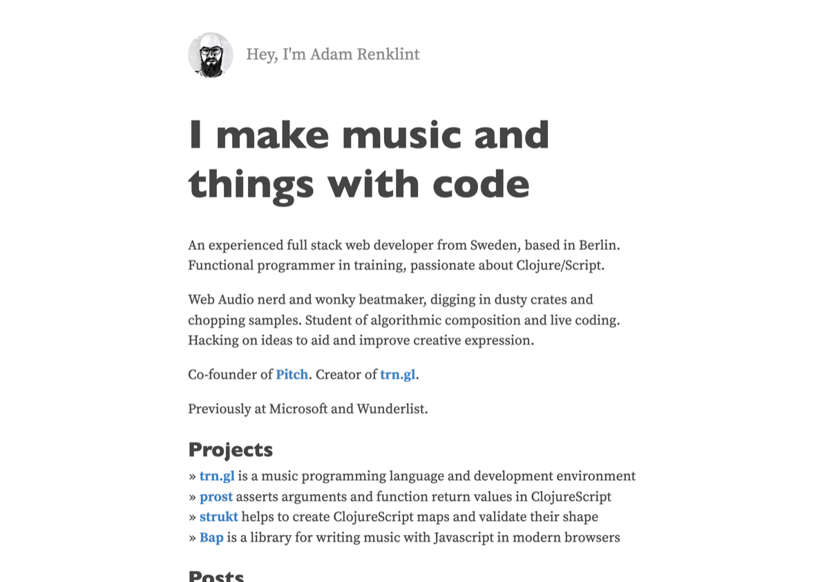
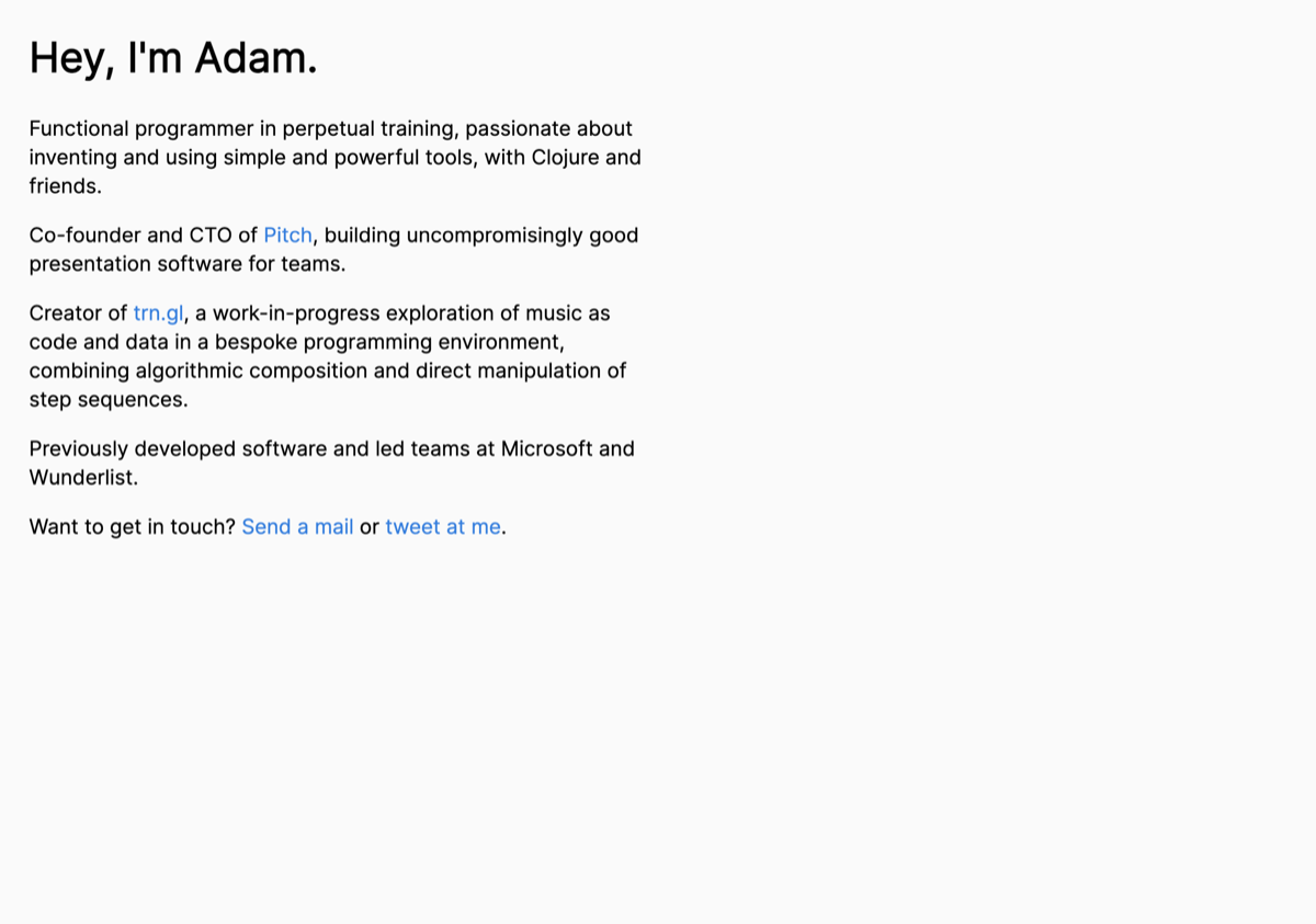
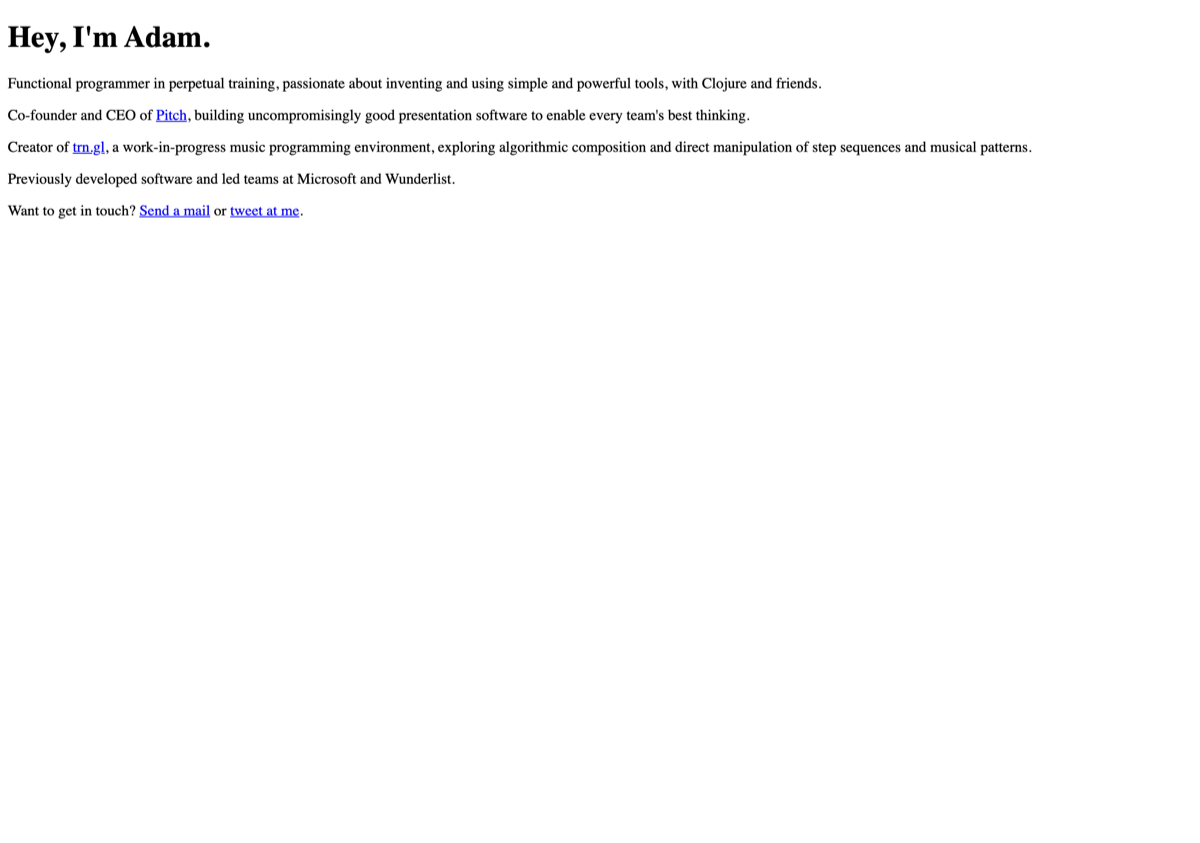
The throughline is obvious in hindsight: I keep chasing simpler. This latest one feels like the end of that particular road — though I've thought that before, and I'll probably think it again.